


10 Oct Element of Design: Choosing and Balancing Color in Interior Design
Following color trends is a fun part of my job. It is always interesting to see how design is changing and what the latest trends are. However, for me, building a color palette is more about each particular project and my clients’ desires. My clients look to me to interpret their desires and tastes into a cohesive design that fits into their home’s architecture. My goal is to create a design that will outlast the latest trends. I like to start with a few basic neutrals and then add in accent colors for smaller items such as a fun chair, unique piece of furniture, rugs, pillows and throws which can be easily changed to reflect what is going on in the design world. Paint is another way to add in a touch of what’s most current because it can be relatively easy to change. I love to find an item of inspiration—a fabric, rug, or light fixture—that starts to get everyone excited.
Color trends are often based on taking a current color and tweaking it—changing the saturation level, shade or tone within any major color group to give them a fresh look. When my clients have a color in their head which may already be dated or tricky to work with, I work to find a more modern version of it. Sometimes all it takes is shifting a bright blue to a navy, a pink to a lavender. In the traditional-styled home below, my client had expressed a desire to use blue. I suggested using a deep shade that was more current and paired nicely with the beige and gold tones she liked as well.

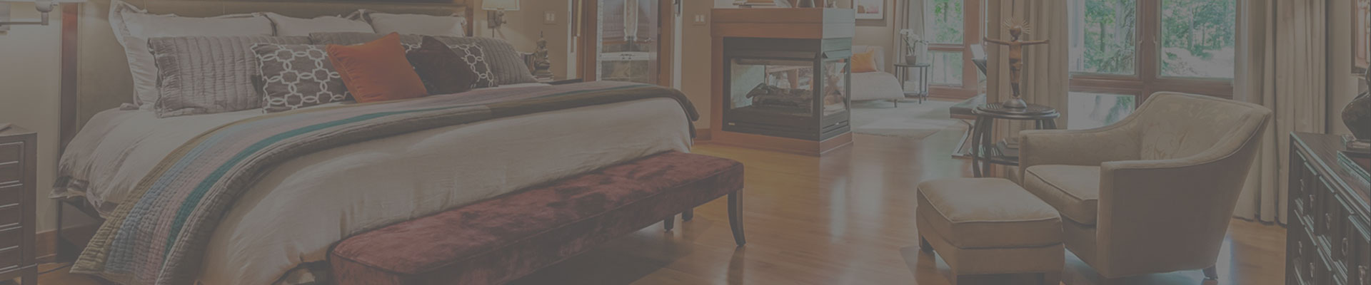
I tend to lean towards neutrals colors and textures on furniture, and then use bold colors in broad sweeps throughout the rest of the design. In the home below, my client wanted to feature her favorite color: orange. By pairing the orange with shades of gray and cream, it actually stands out more and draws the eye to it first. It adds pizazz without overwhelming the rest of the space.

Though gray is a hot color right now I think it also falls into the neutral category, so I enjoy using it. It works so well with other colors, and depending on the shade, can be used to add a cool or warm feel to any space. Here I mixed different textures, patterns and shades of gray to add interest to the design.

The color palette can have a domino effect on other selections, and vice versa. When starting a project from scratch I often choose colors very early on. Those choices then influence everything from wood stain, cabinet color, countertop material, backsplash tile—all working together to create a final design that flows. Below, we changed the wood floors from a medium-stained oak to a dark walnut stain, which contrasts nicely with the gray and orange scheme. The glass tile backsplash, polished nickel and crystal light fixtures add sparkle and shine to the overall palette.

The use of color is a fantastic way to express your style, and though trends are fun and exciting to follow, don’t let them overwhelm you. Find colors that speak to you and that will bring you joy and comfort throughout your home.
No Comments