


04 Dec Elements of Design: Color
Color is a basic aspect of any interior design project, but it is also one of the more personal and fun elements. A unique palette makes a home’s interior design distinctive, and it can easily be used to express the personalities of the homeowners. Applying a good color scheme can be tricky, though. Combinations are endless; it can be difficult to choose between them.
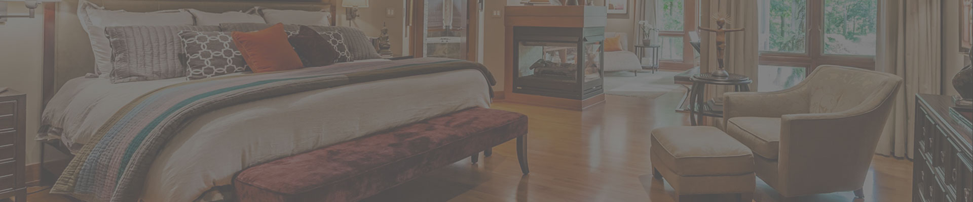
The two most common mistakes in creating an interior color scheme is 1) the same color is used too often, and 2) so many different colors are used that they distract from the overall design. Choosing hues and tones is not just about seeing what will go with your rug or couch—the designer needs to understand how to use color to bring certain elements to the forefront or push them into the background. In one client’s bathroom, I used a rather monochromatic palette to create a relaxing space. The wood cabinets, light-colored counters, wall paint, floor and shower tile are all shades of cream and brown. The contrast between the cabinets and the rest of the bathroom brings out the warmth of the wood against the peaceful cream suroundings.


Though you do not want to use too much of one color, choosing one or two to apply room to room makes the house feel cohesive. I like to implement this trick as much as possible. In a Zionsville home, I choose a homogenous palette to let the architecture and art work of the house shine. Every room had browns, grays and taupes, with very limited pops of blues or greens. No space felt out of place in the earth-toned scheme.

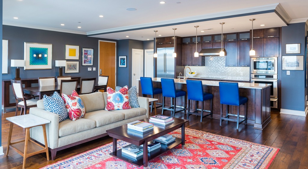
I really like the editorial process of going through a home trying to find the perfect place to fit the most effective tone. In one project, my client’s Indianapolis condo had a bold palette. This was due to this specific client’s outgoing, fun-loving personality. We pulled primary colors out of his existing art work: bright yellows, reds, and blues. To fit these saturated hues into the same space without becoming overwhelming, I choose a neutral dark gray for the wall paint. The gray made a sharp contrast with the floor and woodwork, but it was a strong enough statement to hold its own with the blues, reds and yellows. By distributing the bold colors throughout the whole space, the room felt balanced.
I love how a personal statement can be made with color. Within my clients’ preferences, whether that be soft tones or loud and bold choices, that creativity can find that perfect combination to fit their home design.
No Comments