


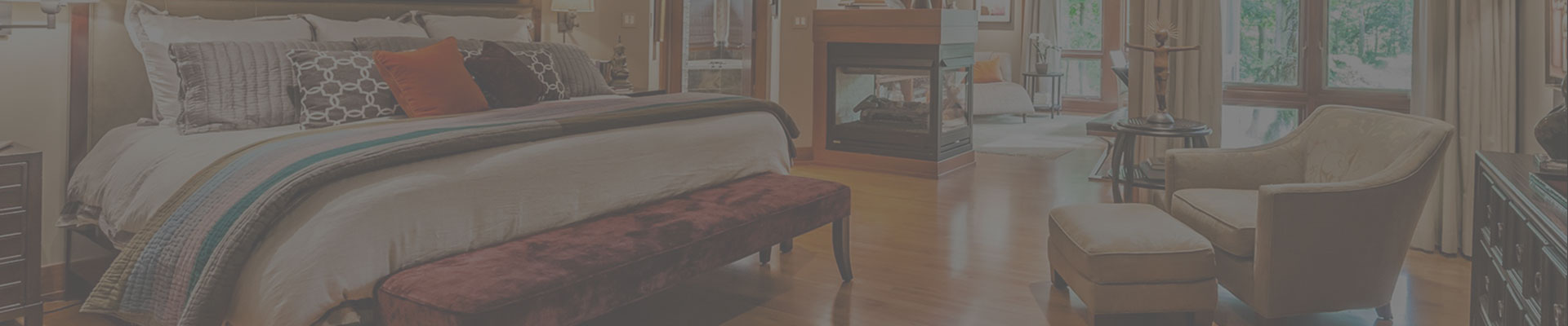

08 Jan Element of Design: Balance
Balance is a conceptual element of design, unlike the more concrete element of color, but despite this it is often easy to tell when the balance of a space is off. To define, balance is the way elements (such as colors, textures, furniture, accessories or lighting) are distributed within a space. Without balance, a space can seem unstable, or simply be aesthetically unpleasing. A room that has bright green everywhere may feel overwhelming, and a darkly furnished room with poor lighting may feel oppressive. A balanced room will have visual anchors and lead the eye around the room in an even pace; elements will complement each other rather than compete for attention.
When remodeling the design of a home, I often must achieve balance around the elements the house already has. For example, when redesigning a client’s rustic home in Zionsville, I had to bring in furniture and accessories that would help balance the heavy stone architectural details of the rooms. In the entryway below, the stone wall and the stone staircase had the heaviest visual weight in the space. To counter the stone wall’s dominating presence, I placed a large wooden console table opposite the wall, which holds decorative pieces to draw the eye. Echoing the art piece hung over the table, I also hung a large piece on the stone wall, further reducing the wall’s visual impact. The lighting I installed above each art piece provides a more even distribution of light throughout the entryway. As a result, the space felt cohesive; the elements of wood, art interest, and light complement each other, none overpowering the other.

In my last blog, I talked all about the element color. In balancing a room, color can make or break a visually pleasing design. For a condo in Indianapolis, color became vitally important to achieving balance. The open room, as pictured below, had a dining table, a sitting area, and a kitchen all in one space. By carefully choosing two colors (red and blue) from my client’s artwork and spreading them over the whole room, I was able to bring the separate areas of the room together.
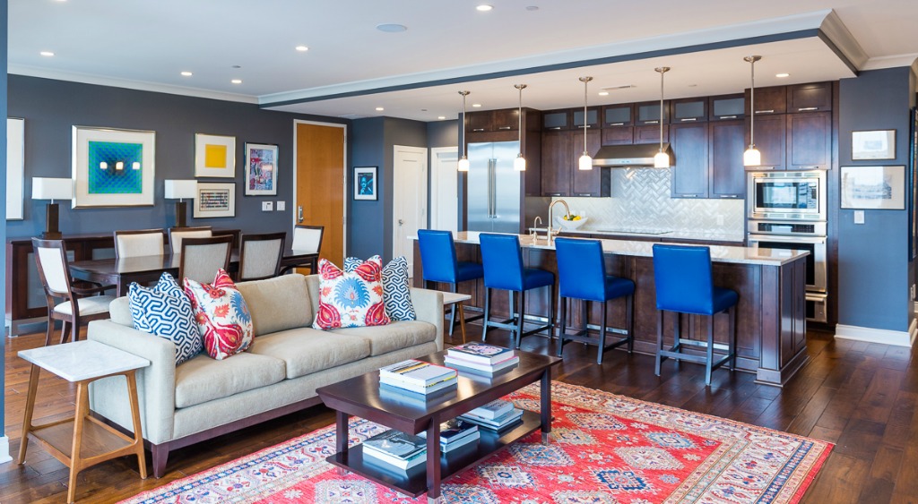
I chose blue for the bar chairs, the pillows and rug, but that blue can also be found in the books on the shelves and the artwork; the red in the carpet and pillows, however, keeps the blue from dominating. Shapes were also important to making this room cohesive. You can see even the lamps and the bar chairs have a rectangular shape, echoing the rug, pillows and artwork. Working on a more subtle level, the similar patterns of the pillows and rug in the middle of the room made it a visual center, anchoring what could have been a big empty space with nothing to look at. The eye is therefore drawn around the room by the blue and red colors, the bookshelves, the rug and pillow patterns, and the artwork.
Though balance often takes hard work to achieve, once I’ve created an interior design that is cohesive and attractive, once all those elements fall into place and start flowing together, the pay-off is a beautiful space that is a pure pleasure to live in. Balance is one of the key elements behind my philosophy as a designer, the key to creating a home my clients love.
No Comments