


08 Dec Lake Wawasee Guest House Remodel
A getaway home should be a calm, relaxing place to unwind. A cluttered, dark space does not create that atmosphere like bright, clean rooms do. My clients wanted to maximize the soothing potential of their guest house on Lake Wawasee. The original design was outdated, with lots of wood paneling and a red and navy color scheme that made the small rooms feel closed in. My goal for this house was to create a more sophisticated look, but still have a fun, easy-going atmosphere combined with a calm, lakeside feeling. We also wanted to bring in colors from the main house to tie the two properties together.
We began by removing all the white-washed wood paneling, which went a long way to updating the look. An overwhelmingly teal carpet ran throughout the whole house, which we replaced with user-friendly tile in the kitchen and bathroom, and a new white-cream carpet everywhere else. The house’s small rooms benefited from a light color palette to create an open and clean feeling. Bold orange, aqua blue, and a tree green were brought in from the main house to punch up the color scheme.


The kitchen got a clean coat of white paint on the cabinets and island. We replaced the tile back splash and counter tops, added some canned lights, and new green bar stools to finish the refreshed look.

In the living room, we maximized seating using a few old family chairs and a new sectional couch. As a gathering place, the living room especially needed to have a fun atmosphere. I gathered an ensemble of mixed materials that could balance each other. For example, I contrasted the wooden furniture with reflective metal tables.

I used fabrics of differing textures and patterns for balance as well. The rougher texture of the chair and sofa coverings has an organic feel, the sofa pillows add more floral touches, while the orange rug has a strong geometric pattern.


The desk pictured below is solid concrete. When keeping a room neutral and calm, I like to mix materials that have roughly the same color, but look different due to their texture or pattern. The gray concrete, while looking heavier, blends with the gray of the metal side tables, lamps, and brushed silver of the bar stools.

In the bathroom, we continued the light color palette and updated everything, from new tiling to plumbing and lighting.

I wanted to keep the bathroom classic, with fewer fun flourishes. The blue roman shade is the sole pop of color. We also enlarged the shower area and cabinetry.

The bright orange was the perfect accent color for one of the bedrooms. The existing furniture was all white, and against the similar-colored walls and carpet the look would have been flat. Painting one wall bold orange made the white furniture pop out against it. The blue in the lamp and the artwork brought in a lake element.

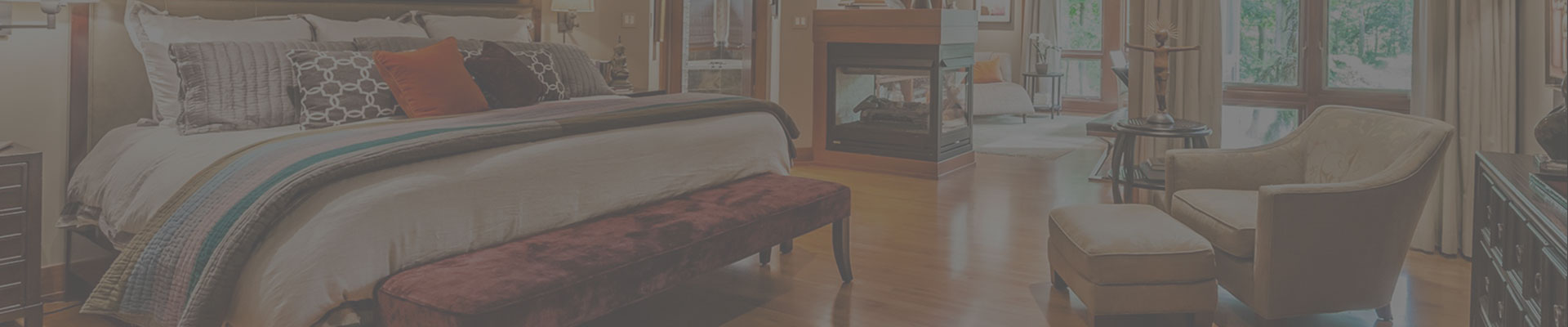
In the bedroom pictured above, I chose green as the main contrast to the white furniture, with aqua as the accent. Here the goal was to make the best use of the small space while still incorporating fun elements. The fabric on the pillows and the roman shade have an organic, soft geometric touch, while the side tables have strong geometric shapes, and the round ottoman and square chair emphasize clean modern lines.


The guest house is now bright and inviting, with a classic style that won’t become outdated anytime soon. Relaxing should be no problem in this lakeside cottage.
Diane
Posted at 23:54h, 10 JanuaryCharming! You always exhibit your special talent in working so effectively with color!! Would love to spend a weekend in this lovely cottage.